Friday, December 4, 2009

OTHERS

1. "Enjoy Daily" for Comedy Central by Modernista! Boston

The only complaint I have against this spot is that I find it too long. Otherwise, it's funny and unique.
I wonder how they shot it...my best guess is that they gave actors a glass of water (or milk, or whatever) and then told them a joke. All of this while the camera was rolling. It must have been a fun day for the guys at Modernista! Boston. Thinking about shooting this type of ads makes me want to work in the advertising industry. After all the hard work of concepting, you can just have a laugh while your idea is becoming a reality.


2. "Superheroes" for Universal Orlando by David&Goliath

This is another technique commonly seen in ads. The typical boring middle aged man that is just realizing that he never accomplished his childhood dreams. But then discovers an awesome place (in this case, the Universal Studios) that will make him to fulfill his wishes. It's a nice ad to watch, but David&Goliath could have done better things with the Universal Studios.


3. "Amplichoir" for MTV & Dell by Mother London:

Going back to the post about advertising by bringing stuff together, that technique is also seen in this new project for Dell and MTV. They are inviting everyone to upload a video of themselves singing "Lollipop" to create the biggest choir in the world. You can also vote for the best performance, and the winner will get tickets to the MTV Europe Music Awards. It's a pretty cool idea, but I don't think it's very original.
I was just surfing the internet when a Starbucks ad popped. It was announcing the company's Love Project, which is very similar to this one, except that it is for the benefit of a charity. You can see the promotional video below, and you can look up the actual song on the project's webpage.
This brings me to the question...who came up with the idea first?


4. "Escape your boring gym" for Funktion Personal Training by Rethink, Vancouver.

This is so funny. I'm sure the guy driving the static bike had a blast that day!
I think that having him driving around the streets definitely attracted the attention of many people, but was it effective? I don't really know. You can't see at first sight that he is promoting the Funktion Personal Training organization. But maybe there was some free coverage on the news that night explaining what that funny guy was doing. That is what usually happens, isn't it? Or maybe, the company later decided to give out flyers or launch print ads with the tagline "Escape your boring gym" and some reference to the non-traditional advertising above. Who knows. I only know that his guy probably wasn't the only effort to advertise Funktion PT.


5. "Nightmare" for Gossip Girl by WONGDOODY, LA
I like the tagline. I'm sure it puts into words what many parents think about Gossip Girl.
It's definitely appealing to the younger crowds by telling them to watch the show because it's so good that their parents wouldn't approve of it. I see it as a dare. "I dare you to watch something your parents don't want you watching". Is it responsible? Nah. Does it matter? Not really. How much harm can be done by watching a show?


6. "Truck" for Gold's Gym by TAXI, Calgary, Canada
This is another way of advertising Gold's Gym. Remember the spot I showed done by McKinney? (see Havas) Well, I like that campaign better than this one.
This one kind of reminds me of Superman. No matter how many times you go to the gym, you will probably never be able to lift a truck like this guy. The ad is deceptive. On the other hand, the McKinney spot is more down-to-earth. It makes you believe that you can get in shape by going to Gold's Gym.
Two different approaches to choose from. Which one do you pick?


7. "Monsterizer" for Buffalo Wild Wings by 22squared

Doesn't this remind you of CP+B's Facial Profiler for Coke Zero? What I'm seeing is a growing trend in the technique of pulling the public towards webpages by giving them games. Specifically, interactive games.
Did you ever hear about the Doritos' Hotel 626 by Goodby Silverstein & Partners? It also involved a game and a webcam. What about the cool Orange website (by Y&R Interactive Tel Aviv) that could only be accessed when you connected your webcam to prove that your lights were off?
I wonder what will come next...I'm excited to discover what new surprises the interactive creatives are preparing for us.


8. "Hallucinations" for the Montana Meth Project by Venables Bell & Partners, San Francisco


This ad is shocking. It's pretty depressing to see how people destroy themselves. But I guess the shock factor is sometimes required to make a lasting impression in the audience. It's like the Truth campaign against smoking (by Arnold and CP+B), better give shocking images and facts than taking this horrible subject in a light way.

Thursday, December 3, 2009

i retract what i said earlier...

This ad by Crispin Porter + Bogusky for American Express is inspiring. Inspiring for those who are hesitating to open their own businesses. It makes me think differently of CP+B because it is nothing like the Facial Profiler for Coke Zero that I showed in one of my older posts (see MDC).
I am glad there are people out there trying to reactivate the economy. There will definitely be a shift from corporate businesses towards smaller ones. It will probably be just for a while; just during the time it takes us to regain trust in the big companies.


An interesting fact is that people shown in this ad are real cardmembers and small business owners. Very cool.

Good job CP+B!

Wednesday, December 2, 2009

Cramer-Krasselt

This ad, "World Upside Down" for Ad Council, reminds us that accidents and disasters happen in the blink of an eye. It gives a good message within an okay ad.
I don't think it's a very well executed ad. I find it unnecessary long. Why does the family have to float for so long in the air? It makes it boring for the viewers. I would have put an extra scene there. I am not very creative, but I just know that I don't like it this way.


Come, on Cramer-Krasselt! This ad for AirTran is not creative. Like I said in the Publicis entry for Team One Advertising, old people acting like they are young is not funny anymore! Please come up with better options.
The fact that AirTran is allowing people under 23 to fly for free is a cool enough factor that should spark interesting and creative ideas in Cramer-Krasselt. I don't know what made them decide to use the old people idea. Too bad. It was a wasted opportunity.


Doner

This idea behind this ad for The Coleman Campsite is funny. And it goes well with the holiday season. It makes you want to be with your family and friends, sharing moments of joy. I like the "vintage" technique--the use of homemade videos. And I also like how they kind of criticize facebook and myspace.
It's a creative way of attracting older and newer generations to buy the same product.


With a different approach, Doner made this hilarious ad for Minute Maid. It's simple comedy, not very dark, and it gets the message to the audience: put good ingredients in your body, and you will perform better. I don't really believe in this product, but the ad is just so funny.


The Richards Group

I like the fact that the Richards Group is in Dallas. And so close to SMU!

This next image is for the Chick-fil-A account. When I first saw the cows encouraging us to "eat mor chikin," I thought it was a brilliant idea. But now I think it's getting old.
The Richards Group should start thinking of a new way to advertise this fast-food chain.
The approach taken for Chik-fil-A could be similar to W+K's approach for Nike: it's more like a platform, not individual campaigns. But, in contrast to Nike, Chik-fil-A's ads seem to be always the same.
I would suggest: either the Richards Group comes up with a new idea (no more cows that spell wrong, please!) or it finds variations to the way they present their cows.
On the more positive side of my critique, I have to say that the website for Fruit of the Loom is pretty cool. Who would have thought that a cotton apparel company could be so fun?
Hopefully the account people behind Fruit of the Loom at the Richards Group won't follow Chick-fil-A's example... I'm a firm believer in innovation

Monday, November 30, 2009

Bartle Bogle Hegarty

  • For Lynx (Axe) by BBH, London
This ad could easily go fit in my "irresponsible ads" post. I find it distasteful and insulting.
Like I mentioned in the Cliff Freeman & Partners spot for Quiznos (see MDC post), this could also be classified as a guy ad. A difference is that, as a woman, I can bear to look at the Quiznos one. I don't find it funny, but it doesn't bother me. This one, on the other hand, is horrible. I think it's insulting for every woman out in the world.
In general, I have to say that I disapprove of all the Axe (or Lynx) ads. They make women look like stupid objects. I wish a smart creative could come up with a better idea of selling man products.

  • For AudiTT TDI by BBH, London
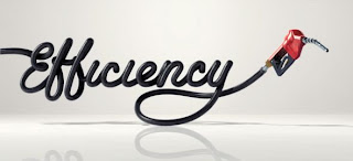
First of all, I think its an insult to an Audi to draw it using only a gas hose. The car deserve better than that.
Also, the idea is far from being creative. Please go back to one of my first posts, the WPP one. Then look at the Grey ad I put. See where I drew this statement from?
Another example is this Toyota's ad by Saatchi & Saatchi, LA:
BBH is probably the agency I dislike the most. The first thing that comes to my mind when I think of BBH is Axe. The Axe campaigns have disappointed me a lot, so I don't have a good image of the agency. And then I see the Audi car print ad which, to me, shows a lack of effort.
I don't have many good things to say about them.

Sunday, November 29, 2009

Weiden + Kennedy

  • "From Santa" for Target by W+K, Portland:
This is a funny approach taken by W+K. Instead of depicting the perfect holiday moments like Wal-Mart is doing, they are building awkward moments. I'm sure the connection with the public is not about remembering a past experience, but the fear of having these awkward holiday moments. How bad would it be to argue in front of little children about a gift from "Santa"? Or, if you have seen the other spots on national tv, giving your girlfriend/boyfriend an expensive-looking gift that could mean "something more"? (Watch it: http://www.youtube.com/watch?v=zy7LyV0AgEI)

  • "Slap" for the Jordan Brand by W+K, New York:

If you every need an inspirational ad, count on W+K. Their work for Nike never stops amazing me. Although they always use a similar approach (you make it about the athlete, not the shoe), they are still very successful.
I'm actually glad that Nike has decided to stick with a same agency all over the years. To me, Nike has an image of constantly delivering the best products, and of being reliable. I think W+K is one of the many reasons behind this success.
I can say that W+K has built a successful platform for Nike...or do you see specific campaigns? Remember that Bob Greenberg (from R/GA) encourages this approach. I think this is why R/GA handles the technological part of Nike.

  • Need for Speed Shift by W+K, Amsterdam


This is such a cool ad. I don't think someone had ever thought of stepping into the shoes of a virtual race car driver. You can feel the driver's adrenaline. And the digital animation is excellent as well!

Monday, November 23, 2009

Havas

Arnold Worldwide
"Off to Work We Go" by Arnold NYC:

What a cheater!! They stole the idea from W+K's Happiness Factory for Coca-Cola! I don't like this.
I like the animation, the ad was done well, but couldn't Arnold come up with its own idea??
The truth campaign (made in collaboration with CP+B) was very creative...so what happened here?
The only conclusion I can make is that CP+B was the right-side of the brain (the creative one) behind the truth campaign, and Arnold was the left side (the logic one).
Arnold disappointed me. A lot. It's an insult to the creative world. Hopefully they have some good work to follow this failure.

Euro RSCG
"Fail" and "Pass" for McDonalds by BETC EURO RSCG (Paris):
This is so funny. BETC EURO RSCG launched this campaign the day French students took their baccalauréat, the super hard exam that students must take at the end of high school.
There's a "fail" edition and a "pass" one. It says that you should go to McDonald's, whether you passed or fail. And the funniest part is that both print ads look the same, although the girl is crying of happiness and the boy of sadness. So funny.
I'm sure French students found it funny...probably not immediately after the test.

McKinney
For Gold's Gym:

This ad makes me want to go work out. Who doesn't want to be the "leanest," "meanest," and "baddest"?
I think it's funny how the lady isn't sweating at all. She makes exercising look easy. McKinney probably decided to show her this way because sweat makes some people uncomfortable. I, on the other hand, think they should show a fat person sweating. This would make people think: "if he can do it, I can do it too."

Monday, November 9, 2009

Dentsu

  • "SoftBank Mobile Corp: Quentin Tarantino" by Dentsu, Tokyo:

The fact that Quentin Tarantino is in the ads makes them much better. But the celebrity won't make an ad great.
I enjoyed watching the Dentsu ads on class, and this one doesn't seem to follow the pattern the others did. It's very different from the American & European ones, but I don't find it funny like the other ones. Maybe this is because another office did it, or the change in product demanded a change in approach...I don't know. I just know I don't like this ones.

  • For the Philippine National Nutrition Council by Dentsu Philippines:
A unique way of fighting obesity. And I like it. It seems that this one is taking the "Western" approach we are used to seeing: it's clever but it doesn't surprise me.
I like it though, because it makes you read the tagline. It's a new way of saying "You are what you eat".

MDC

Crispin Porter + Bogusky
"Facial Profiler" for Coke Zero:
I've always thought that CP+B has the weirdest and creepiest ideas. Think Subservient chicken, the BK king, and now this facial profiler.
How creepy would it be to find a person that looks like you??
I'm sure of one thing. This creepy application is probably pulling a lot of users into the Coke Zero webpage (www.facialprofiler.com), which, itself, is pretty cool looking.
Go to the webpage, and if you try the facial profiler, let me know if it works. I'm afraid to try it out because I don't want to know if there's someone out there like me.

VitroRobertson
For P.F. Chang's:

I can imagine why VitroRobertson and PF Chang's agreed on carrying out this type of non-traditional advertising. I'm sure it drew a lot of attention from the press!
But it makes me think that PF Chang's (like other companies) are just donating money to charities for the wrong reason. That is, for the free publicity. It makes me sad to think this...but at least they are helping those who need it.

Cliff Freeman & Partners
For Quiznos:
I would describe this ad as a guy ad. The humor isn't appealing to me, but I guess my brothers would find it funny.
I don't like it a lot because it looks like any fast-food or beer ad directed towards men only.
I don't mind eating Quiznos, but the guy eating the sammies with his 2 hands (at the end of the ad) is disgusting. It doesn't make me crave Quiznos food.

Kirshenbaum Bond
For NetJets:
This looks like the type of ad you would find in a high-class magazine. I can't come up with names right now, but I'm sure you understand what I mean...It's for a company trying to sell jets. So, you get my point.
I like that they chose Roger Federer. He seems like a good role model. I say "seems" because you never know what mistakes he might make later. But I think that he's a good image for the product and he is worth taking the risk.
Hopefully he won't mess things up and keep selling NetJets.

Monday, November 2, 2009

Together

There's a trend in advertising...of stuff coming together.
These next 5 ads use this technique of bringing large scale of performances to sell a product.

1. Palm pre "Flow" by Modernista! Boston:
This is such a cool ad because of the many people in it. It reminds me of the opening ceremony at the Beijing Olympics. The act was executed in perfect harmony. A visual delight.


2. FIFA 10 "How Big Can Football Get?" by W+K, Amsterdam:
This ad shows how the world loves football soccer. And I'm no exception. This ad makes me excited about the 2010 World Cup.
It's cool how they use large scales of people to show the greatness of soccer worldwide, but also how they use soccer balls throughout the spot. Did you notice the balls in the ocean? Also, the balls falling out from the net remind me of the bouncy balls ad for Sony Bravia by Fallon.


3. Honda "Let it Shine" by W+K, Amsterdam:
What I like about this ad is that they actually filmed it! There was a lot of effort put in it, and it shows. (To look at how they filmed it, check out http://www.youtube.com/watch?v=pcHgxgs6SEg)
Of course, it had to be W+K


4. Tide "Ketchup" by Saatchi & Saatchi, New York:
This isn't my favorite but it's pretty cool. I'm coming to the conclusion that having a lot of people together for an ad immediately takes it to a new level.


5. T-Mobile Dance by Saatchi & Saatchi X UK:

A nice example of a flash mob. I wish I could have seen it with my own eyes. These performances suddenly became famous. You could find new youtube videos from all around the world. But Saatchi & Saatchi actually organized one for commercial purposes. Maybe it was effective, maybe it wasn't. But it's a pretty cool looking video.

Monday, October 26, 2009

Publicis

Publicis
By Publicis Conseil, Paris for Orange:
This ad is so smart. And I love it.
I like how Publicis put the hearing and listening pieces together. The images are taken out of our daily lives, while the narrator has a very smooth voice & the background music is just perfect of this spot. My favorite part of the ad is when the lady starts her "fight" to walk. It's so inspiring.
I have to admit I was disappointed when I realized that the ad was advertising an internet service provider. I guess I was expecting something "smarter".

Fallon
By Fallon Singapore for P2: multi-purpose contact lens solution:
This is comedy. I couldn't stop laughing when I found this ad. Just look at the baby's face!
The baby's expression looks very real, so I don't think it was computer generated. I think Fallon just went over many baby pictures trying to find the most appropriate one for their ad, and then just added the other images digitally. I can just imagine the creative team, laughing really hard when looking at all these funny babies.
This reminds me of Ogilvy's print ads for Pampers called "poopface" (if you haven't seen them, google them, you will laugh).

Saatchi & Saatchi
By Saatchi & Saatchi, Germany:
Another baby-related campaign. A more serious one.
In this one, Saatchi & Saatchi decided to show parents the struggles that babies go through every day by recreating their world.
In order to sit in this bench, adults have to climb it, just like a baby would.
I really like the campaign. It's very creative. What a better idea to make parents buy the Pampers brand than to show them that their kids need diapers that allow for a lot of movement? I don't think there's a better one. Thumbs up for Saatchi & Saatchi.

Leo Burnett
"Baby Ronald" by Leo Burnett, New Delhi, India:
Another baby one. But this one is creepy.
Leo Burnett launched this print ad when a new McDonald's opened in New Delhi. If you think about it, it's a clever idea. But, the baby Ronald is soo scary!
It's like a fusion of the Chucky doll and the clown from Steven King's It movie. Which brings me to a good idea, they should make a horror movie using this kid! Not to be mean, but...it would make a pretty good Halloween movie.

Kaplan Thaler Group
"Dump Cupid" for Herbal Essences:
The cupid guy is so funny.
But I don't like the message Kaplan Thaler is propagating. They are saying that if you have a boyfriend, then you should have pretty hair in order for him to keep liking you. And if you are single, then it's probably because you don't have pretty hair. So, in both cases, you must buy Herbal Essences.
I'm sure that many single girls, after seeing the dumb cupid, went to fix their hair. Just in case.

Team One Advertising
For Boost Mobile:

Old people acting like they are young isn't cool anymore.
How many times have you seen this technique? Even if there aren't many ads out there using cool old people, it seems like there are because you get tired of the same formula.
The first time is always funny, then the joke gets old pretty quickly.
Let's try to avoid this, please?

Thursday, October 22, 2009

what a waste of talent

By Tribal DDB for VW:

I love the idea. But for VW? I don't think so.
The creatives responsible for this should put their great minds to make more efficient work.
Not to be a pessimist, but I consider this to be a waste of talent.

Monday, October 12, 2009

Interpublic

McCann Erickson
"Lessons" for Master Card by McCann San Francisco:

I have always loved the MasterCard "priceless" ads because they make you appreciate everyday things in life. Like this one, it makes you appreciate the people that are taking steps to save the planet. It also gives you a lesson of how you should be taking care of the Earth.
Although I always enjoy watching one of these ads, I think the campaign is getting old. It has been around for a long time. The ads are different every time, but the concept is always the same. McCann should come up with another great idea for MasterCard as a substitute to those priceless ads.
Maybe they haven't done this yet because they have big shoes to fill in.

The Martin Agency
For Hanes:

This ad is so funny! And it's true too.
Haven't you ever experienced those uncomfortable moments? Be honest. I'm sure everyone has.
Like the 180 and the Dieste ad, this one is giving little truths that everyone has experienced. This way the public can better identify with the problem and see that the product (the Hanes underwear) could be a good solution to it.
I liked the idea of hiring the actress Sarah Chalke, from Scrubs, because she's really funny. And it makes the fans of the show want to watch this ad.

TM Advertising
For American Airlines by TM, Dallas:
I don't get the point of this ad. Are they trying to insult Harvard? Well, not insult, but make a point that it isn't the great school that everyone thinks it is?
Or are they trying to send the message that those that fly AA are Harvard alumni that need to learn a non-textbook lesson?
When I found this ad, I saw that it was a Silver Winner at the 2007 London International Awards. Which makes be think that I don't really get the message.

DraftFCB
Anti Drunk Driving Campaign for Drive Alive South Africa by Draftfcb Johannesburg:
This is a cool idea. But I don't see how it could be an effective one.
I think it has too many words for a person to read while he/she is driving.
Isn't the whole point of preventing drunk driving to make streets safer? Then, why would you want to distract the sober & drunk drivers by giving them lines to read in the middle of the road?

Lowe
"ElectroCity" for Genesis Energy:
I like this idea. Making a game available online to teach kids about energy and the environment. The webpage says it was designed for kids 7 to 9 years old. And there is even a section for teachers, where they can find lecture notes that relate to the concepts taught in the game and precise instructions of how to use the game for class.
This is a great example of social responsibility. Lowe is trying to educate the future leaders of our world by introducing them to our current problems since an early age. Good job!

Carmichael Lynch
For Subaru:

I like the storyline. It's something that would happen to me. But I don't see how it is an effective ad. And this isn't just a problem I have with this particular ad; I have it with all car ads.
The way this spot was created reminds me of the Arnold VW ads. They don't advertise the qualities of the car and they aren't trying to make a comedy, they just provide a nice story we can imagine ourselves in.

Hill Holliday
"Responsibility" for Liberty Mutual by Hill Holliday Boston:

I love this campaign. Do you ever wonder if this happens in real life?
I do and watching this ad makes me want to go do a social experiment.
I don't think I'll ever find out if people are good like the ad shows. But, in the meantime, help someone. It might turn into a chain of good deeds.

Deutsch
IKEA guerrilla marketing by Deutsch NY:
This is one of those images you get in emails. Those showing "cool" advertising.
And I think that's the most effective point this campaign will achieve.
How do you think people reacted when seeing a bright green sofa instead of the bench that is always there? I think they got confused, thought that it was cool, and then never found out what had happened that day at the bus stop. By looking at the image above, I don't even see the IKEA logo!

Mullen
For the New England Aquarium by Mullen, Boston:
Very nice image. I want to think it's a photograph, not a digital creation.
When you are flipping through a magazine, it's one of those images that appear in the middle of it and make you stop and look. That is probably why they also used the bright green.
It doesn't make me want to go to the aquarium, but the cool turtle certainly puts it in the back of my mind.

Campbell Mithun
"Make Today Famous" for Famous Footwear by Campbell Mithun, Minneapolis:

I can define this ad with the word: cute. It's not the best, but it is pretty.
I have to say that this spot reminds me of a Payless Shoes commercial, which is not good for Famous Footwear. Probably just by the way they shoot their shoes. Which brings me to a conclusion: agencies working for shoe companies need to come up with more creative ideas. ASAP.

TAG SF
Viva Pinata "Genie" by TAG, San Francisco:
I hate this commercial! I absolutely do.
The worst thing is that I saw it many times on tv. It's so stupid. But I guess I'm not the target audience...
It seems to imitate TBWA\Chiat\Day's technique. TAG gives the piñata a voice and TBWA gives a bunny a voice (remember the Skittles ad?). I think they are both a waste of money. Sorry.

R/GA
"Nokia viNe" for Nokia by R/GA:

This is so creepy! Can you imagine all the stalkers that will emerge with this project?
Why would someone want to record his/her whole day?
I have a strong objection to the direction our society is taking today. Facebook, Twitter, and now the Nokia viNe...I think people should stop making their life through the internet and start having a real life. That is, by interacting with others face to face. Not through computers or cellphones.
In defense of R/GA, I have to say that this idea proves that their agency is still a leader in technology.

Saturday, October 3, 2009

WPP

Ogilvy & Mather
Crystal Light campaign by Ogilvy Entertainment (New York):

I really like this ad because it makes me happy. It makes me want to dance and buy some Crystal Light.
I wonder if it was expensive to hire Estelle to make the jingle. If it wasn't, then good for Ogilvy. I'm sure that a lot of people visited their site to download the song. Otherwise, if it was expensive, I think it was a waste of money. They could have just hired some other good singer.
On the more negative side, I don't think it's a very original spot. It reminds me of the (older) Jell-o tv spot below...the Go Go's were hired to sing this exclusive song, and the actresses dance the whole time.


Young&Rubicam
Danone "Explicación" by Y&R Mexico:

This one is practically mute the whole way until the end, where it ways "It's not easy explaining to a child that he has cancer. Helping is." How depressing.
I don't like these type of ads that play with your emotions in a mean way. It reminds me of those tv spots that ask for money while showing kids suffering with cancer, or poor kids in Latin America, or sick pets. They make you feel pity for them, and then you want to "donate". It's unnecessary.
The acting in this ad is so real that you can empathize with the parents and feel sorry for the boy.
In terms of the reactions it produces, this ad is the opposite from the Crystal Light one by Ogilvy.

JWT
Kit Kat Bench by JWT London, UK:
This is really neat! It does make me crave a Kit Kat!
When I see it, I can only think about the chocolate covered wafers. And it's pretty clever how they are advertising a "break" and how they chose a bench. It's just perfect.
A negative point I could find in this would be the complain that some people are having against the invasion of advertising. Today, advertising isn't only on tv and magazines, it's even on the park benches! Well, to those people I would say, deal with it and get used to it. The world has changed and so has advertising.

Grey
Aquafresh flex top toothbrush "Cleans all gaps" by Grey Hong Kong:
Not my favorite. Seriously, this technique isn't very original and the toothbrush looks just like any other.
It seems like the message is that if you use this toothbrush, then you won't need to floss your teeth. Which isn't true. So, why the lie? Maybe Grey thought the dental floss would make a cool image, but it didn't. Or maybe they thought they would attract more people into buying the toothbrush.
But I don't think it was a very successful ad. So they lied in vain.