Monday, November 30, 2009

Bartle Bogle Hegarty

  • For Lynx (Axe) by BBH, London
This ad could easily go fit in my "irresponsible ads" post. I find it distasteful and insulting.
Like I mentioned in the Cliff Freeman & Partners spot for Quiznos (see MDC post), this could also be classified as a guy ad. A difference is that, as a woman, I can bear to look at the Quiznos one. I don't find it funny, but it doesn't bother me. This one, on the other hand, is horrible. I think it's insulting for every woman out in the world.
In general, I have to say that I disapprove of all the Axe (or Lynx) ads. They make women look like stupid objects. I wish a smart creative could come up with a better idea of selling man products.

  • For AudiTT TDI by BBH, London
First of all, I think its an insult to an Audi to draw it using only a gas hose. The car deserve better than that.
Also, the idea is far from being creative. Please go back to one of my first posts, the WPP one. Then look at the Grey ad I put. See where I drew this statement from?
Another example is this Toyota's ad by Saatchi & Saatchi, LA:
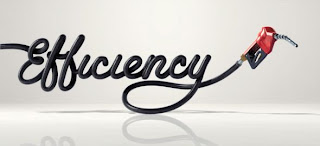
BBH is probably the agency I dislike the most. The first thing that comes to my mind when I think of BBH is Axe. The Axe campaigns have disappointed me a lot, so I don't have a good image of the agency. And then I see the Audi car print ad which, to me, shows a lack of effort.
I don't have many good things to say about them.

Sunday, November 29, 2009

Weiden + Kennedy

  • "From Santa" for Target by W+K, Portland:
This is a funny approach taken by W+K. Instead of depicting the perfect holiday moments like Wal-Mart is doing, they are building awkward moments. I'm sure the connection with the public is not about remembering a past experience, but the fear of having these awkward holiday moments. How bad would it be to argue in front of little children about a gift from "Santa"? Or, if you have seen the other spots on national tv, giving your girlfriend/boyfriend an expensive-looking gift that could mean "something more"? (Watch it: http://www.youtube.com/watch?v=zy7LyV0AgEI)

  • "Slap" for the Jordan Brand by W+K, New York:

If you every need an inspirational ad, count on W+K. Their work for Nike never stops amazing me. Although they always use a similar approach (you make it about the athlete, not the shoe), they are still very successful.
I'm actually glad that Nike has decided to stick with a same agency all over the years. To me, Nike has an image of constantly delivering the best products, and of being reliable. I think W+K is one of the many reasons behind this success.
I can say that W+K has built a successful platform for Nike...or do you see specific campaigns? Remember that Bob Greenberg (from R/GA) encourages this approach. I think this is why R/GA handles the technological part of Nike.

  • Need for Speed Shift by W+K, Amsterdam


This is such a cool ad. I don't think someone had ever thought of stepping into the shoes of a virtual race car driver. You can feel the driver's adrenaline. And the digital animation is excellent as well!

Monday, November 23, 2009

Havas

Arnold Worldwide
"Off to Work We Go" by Arnold NYC:

What a cheater!! They stole the idea from W+K's Happiness Factory for Coca-Cola! I don't like this.
I like the animation, the ad was done well, but couldn't Arnold come up with its own idea??
The truth campaign (made in collaboration with CP+B) was very creative...so what happened here?
The only conclusion I can make is that CP+B was the right-side of the brain (the creative one) behind the truth campaign, and Arnold was the left side (the logic one).
Arnold disappointed me. A lot. It's an insult to the creative world. Hopefully they have some good work to follow this failure.

Euro RSCG
"Fail" and "Pass" for McDonalds by BETC EURO RSCG (Paris):
This is so funny. BETC EURO RSCG launched this campaign the day French students took their baccalauréat, the super hard exam that students must take at the end of high school.
There's a "fail" edition and a "pass" one. It says that you should go to McDonald's, whether you passed or fail. And the funniest part is that both print ads look the same, although the girl is crying of happiness and the boy of sadness. So funny.
I'm sure French students found it funny...probably not immediately after the test.

McKinney
For Gold's Gym:

This ad makes me want to go work out. Who doesn't want to be the "leanest," "meanest," and "baddest"?
I think it's funny how the lady isn't sweating at all. She makes exercising look easy. McKinney probably decided to show her this way because sweat makes some people uncomfortable. I, on the other hand, think they should show a fat person sweating. This would make people think: "if he can do it, I can do it too."

Monday, November 9, 2009

Dentsu

  • "SoftBank Mobile Corp: Quentin Tarantino" by Dentsu, Tokyo:

The fact that Quentin Tarantino is in the ads makes them much better. But the celebrity won't make an ad great.
I enjoyed watching the Dentsu ads on class, and this one doesn't seem to follow the pattern the others did. It's very different from the American & European ones, but I don't find it funny like the other ones. Maybe this is because another office did it, or the change in product demanded a change in approach...I don't know. I just know I don't like this ones.

  • For the Philippine National Nutrition Council by Dentsu Philippines:
A unique way of fighting obesity. And I like it. It seems that this one is taking the "Western" approach we are used to seeing: it's clever but it doesn't surprise me.
I like it though, because it makes you read the tagline. It's a new way of saying "You are what you eat".

MDC

Crispin Porter + Bogusky
"Facial Profiler" for Coke Zero:
I've always thought that CP+B has the weirdest and creepiest ideas. Think Subservient chicken, the BK king, and now this facial profiler.
How creepy would it be to find a person that looks like you??
I'm sure of one thing. This creepy application is probably pulling a lot of users into the Coke Zero webpage (www.facialprofiler.com), which, itself, is pretty cool looking.
Go to the webpage, and if you try the facial profiler, let me know if it works. I'm afraid to try it out because I don't want to know if there's someone out there like me.

VitroRobertson
For P.F. Chang's:

I can imagine why VitroRobertson and PF Chang's agreed on carrying out this type of non-traditional advertising. I'm sure it drew a lot of attention from the press!
But it makes me think that PF Chang's (like other companies) are just donating money to charities for the wrong reason. That is, for the free publicity. It makes me sad to think this...but at least they are helping those who need it.

Cliff Freeman & Partners
For Quiznos:
I would describe this ad as a guy ad. The humor isn't appealing to me, but I guess my brothers would find it funny.
I don't like it a lot because it looks like any fast-food or beer ad directed towards men only.
I don't mind eating Quiznos, but the guy eating the sammies with his 2 hands (at the end of the ad) is disgusting. It doesn't make me crave Quiznos food.

Kirshenbaum Bond
For NetJets:
This looks like the type of ad you would find in a high-class magazine. I can't come up with names right now, but I'm sure you understand what I mean...It's for a company trying to sell jets. So, you get my point.
I like that they chose Roger Federer. He seems like a good role model. I say "seems" because you never know what mistakes he might make later. But I think that he's a good image for the product and he is worth taking the risk.
Hopefully he won't mess things up and keep selling NetJets.

Monday, November 2, 2009

Together

There's a trend in advertising...of stuff coming together.
These next 5 ads use this technique of bringing large scale of performances to sell a product.

1. Palm pre "Flow" by Modernista! Boston:
This is such a cool ad because of the many people in it. It reminds me of the opening ceremony at the Beijing Olympics. The act was executed in perfect harmony. A visual delight.


2. FIFA 10 "How Big Can Football Get?" by W+K, Amsterdam:
This ad shows how the world loves football soccer. And I'm no exception. This ad makes me excited about the 2010 World Cup.
It's cool how they use large scales of people to show the greatness of soccer worldwide, but also how they use soccer balls throughout the spot. Did you notice the balls in the ocean? Also, the balls falling out from the net remind me of the bouncy balls ad for Sony Bravia by Fallon.


3. Honda "Let it Shine" by W+K, Amsterdam:
What I like about this ad is that they actually filmed it! There was a lot of effort put in it, and it shows. (To look at how they filmed it, check out http://www.youtube.com/watch?v=pcHgxgs6SEg)
Of course, it had to be W+K


4. Tide "Ketchup" by Saatchi & Saatchi, New York:
This isn't my favorite but it's pretty cool. I'm coming to the conclusion that having a lot of people together for an ad immediately takes it to a new level.


5. T-Mobile Dance by Saatchi & Saatchi X UK:

A nice example of a flash mob. I wish I could have seen it with my own eyes. These performances suddenly became famous. You could find new youtube videos from all around the world. But Saatchi & Saatchi actually organized one for commercial purposes. Maybe it was effective, maybe it wasn't. But it's a pretty cool looking video.